
Brad's Deals Onboarding
Brad's Deals Onboarding
WORK IN PROGRESS

The Problem
As is the case with many Sites of a Certain Age, our user onboarding process was less a cohesive narrative than a patchwork quilt of experiences put in place over the past few years by different people in different departments under different managerial regimes. We wanted to design an onboarding experience that spoke with one voice, creating less confusion for new users and making it easier to intelligently gather data.


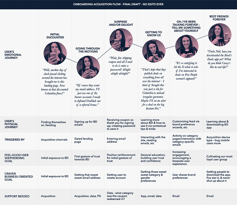
Journey Mapping
A product team colleague and I hammered out an onboarding experience aimed at gaining the user's trust through up-front demonstration of value and ongoing product education & experience customization. I then refined the fruits of our whiteboarding into a pretty little reference chart before coming to my senses and realizing that the only way to successfully work collaboratively across departments with this stuff was in a hideous Google Sheets doc.


Initial Deliverables
Having hammered out our lofty overarching long-term narrative (a journey towards trust), we defined a few initial short-term projects aimed at satisfying stakeholders' immediate needs ("Katie, can you please just add a 'sign up with Google' button to the landing page?")
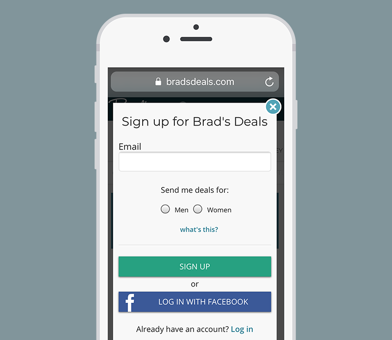
Landing Page Refresh
This was kind of a tricky one—after sketching out a multi-screen educational onboarding sequence for new email subscribers ("it'll be like Duolingo, but even better! Easy peasy!"), we found out that the current landing page for marketing campaigns was such a cash cow that we weren't going to be able to do much in the way of structural changes.
This forced us to get creative, scaling back the initial signup redesign to a visual refresh and flipping our personalization and education efforts from a front-loaded, all-at-once thing to an ongoing trickle.
Category Preferences Quiz
In the interest of gathering user category preferences, I built a Figma prototype of a quiz that promised to generate a customized deal feed upon completion, asking users for their likes and dislikes among broad deal categories, specific product categories, and popular brands.
I think this was probably the happiest accident that came out of having to ditch our initial plans; not only are people who have voluntarily chosen to answer questions more engaged than people who are being forced to do it to sign up for an account, I think the questions themselves work better: "are you interested in seeing deals on men's apparel?" is a smarter and more welcome question than "are you a man?"
Pro Tip modules
To replace the educational content intended for the initial signup, I designed and illustrated helper modules that appear when you encounter certain things for the first time. Again, this is something that I think ultimately works better interspersed throughout the experience rather than being front-loaded before you've even gotten a chance to engage with the product.